
Boulevard // 2021
Client Checkout
Overview
Boulevard is a business management platform for businesses in the beauty, personal care, and MedSpa industries. For this project, I led design for a cross-platform checkout experience — integrating custom payment hardware while also reimagining the end-to-end flow for both clients and the staff members supporting them.
Role: Lead Designer
Worked with product management and engineering to sequence, research, and design for desktop and tablet experiences.
Timeline: 4 months
December 2020–March 2021
THE PROBLEM
For businesses on the Boulevard platform, checkout was restrictive, clunky, and generally disjointed.
This resulted in front desk staff doing a lot of manual work to get through checkout. From verbally asking clients about gratuity (often awkward), to manually entering payment information (time consuming and not always secure), it was clear that there were opportunities to improve the overall experience for everyone involved.
THE OPPORTUNITY
Rebuild the checkout experience to support a new custom payments hardware terminal, and facilitate seamless interactions between customers and staff.
At this time, Boulevard was building its own custom card reader hardware—the Duo—to facilitate secure payments to its customers. However, the new Duo reader couldn’t communicate with our existing client-facing reception app that connected to the desktop platform. In order to support the new Duo hardware, we had to rebuild the app, which was great news because the existing tablet app was outdated and had a host of usability issues and limitations.


The process
DISCOVERY
Understand where we started
Before anything else, I audited the existing 'Reception' app to get a clear picture of where we were starting from and what we were working against. I explicitly called out friction points, unknowns, and other opportunities worth tackling with this new product.
Check in with customers
Through early observational research and customer surveys, I gained an understanding of how front desks actually operated. Generally, there was a lack of visibility into what was going on between iPads and the front desk computers. It was also common for businesses to use multiple devices for multiple tasks.
This was an important early flag: the short-term solution needed to be designed with scale in mind — not just checkout, but a broader set of capabilities (like client check-in and mobile checkout) down the line. This mindset would help guide strategic conversations with my team and shape design solutions to be future-forward.
STRATEGY + PLANNING
Scenarios and sequencing
I partnered with my Product Manager to define and align on our focus areas. With so many moving parts — multiple devices, use cases, and user types — I created visual artifacts to map out the scenarios clearly alongside the defined scope. This shared reference, along with unified user journey “blueprints”, kept everyone aligned as complexity grew.
EXECUTE
Design areas
Based on the phases we defined, I began exploring solutions for each chunk of the project. Doing this ensured that I wouldn’t become a bottleneck and could finish things incrementally and in line with the project priorities.
Self-setup
Creating a seamless setup experience meant defining the steps for the user, putting those steps in the right sequence, and providing the right level of detail for them to be successful without getting bogged down, especially as they navigate between devices.
Device management
On the management side of things, it was important to make device settings accessible but discreet, so to avoid clients accidentally stumbling into the settings screen while interacting with the iPad during checkout. Additionally, businesses needed to clearly distinguish between iPads via unique naming and have visibility into these devices at any given time (connection status, battery, etc.)
Checkout
The introduction of a Bluetooth card reader presented additional considerations to the existing checkout workflow. I worked through this phase with both users in mind at once — mapping the staff experience directly against the client experience to make sure the two worked in harmony rather than creating friction for either side.
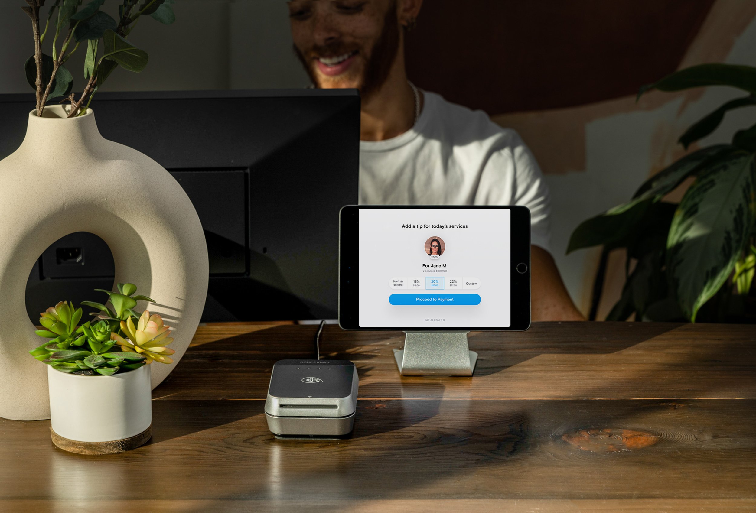
Gratuity and payment
In the final phase of work before the initial release, I spent my time on ironing out the details of the client-facing experience. This included nailing down the tipping process, providing visibility to a clients’ order, and moving them through payment smoothly without any hold ups.

The results
The new client experience
The final product consisted of a fresh new look, polished to fit into any Boulevard-run business. The client tablet experience provides transparency and privacy from the staff member to leave gratuity and make payments on their service. On the staff side, they also have visibility on where the client is in the checkout process, with control to manage devices and move things along and support a seamless experience.


Rollout
A pilot version was released to a small set of businesses, which included the revamped checkout functionality and client-facing gratuity experience. After the pilot, a beta version was released to a broader group of businesses, where the self-setup experience was added along with expanded support for multiple device setup.
Impact
The old Reception app saw a significant drop in usage as customers were tracked moving to the new experience — a clear signal of healthy adoption. Duo payment transactions climbed steadily, and customers reported a 24% increase in clients leaving gratuity.

“New gratuity feature has been splendid so far for the time I have been using it. Breezy”
Takeaways
Hardware is hard. The complexity that came with the payment hardware pushed me to collaborate with engineering in a way I hadn't before. Understanding how the Duo terminal communicated with other devices — when it idled, when it woke up, what could go wrong — wasn't optional. And while the Duo was a driving factor for this project, it was only one part of a broader experience. Getting into the weeds with engineering gave me the technical grounding I needed to design the edge cases and error states that make or break a hardware experience — without losing sight of the bigger picture for both users.